Pablander


I worked as a concept artist with Archetype Entertainment on Exodus, designing creatures, characters, and other bits for the game. Working closely with Art Director Jeremy Cook, I explored visual ideas guided by strong world building and clear artistic direction, while still having plenty of room to experiment. A particularly inspiring part of the process was receiving short descriptive excerpts from Peter F Hamilton, which provided a rich narrative foundation for imagining the beings that inhabit this universe. It was a deeply creative experience where storytelling and design went hand in hand.

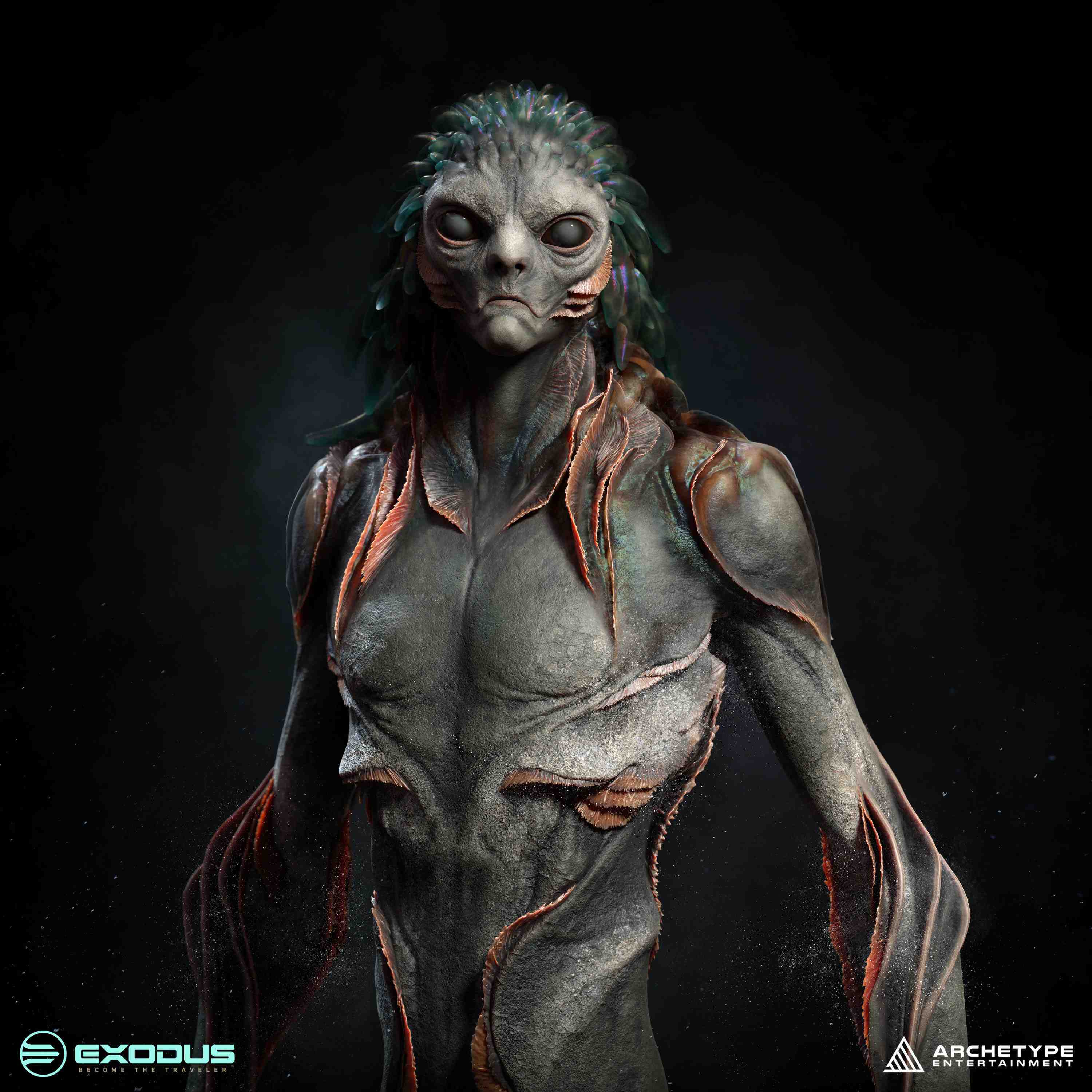
With the Malabrachts, the challenge was less about raw anatomy and more about presence. These were not creatures built for survival or labor… the idea was that they carried a sense of history, status, and ceremony.
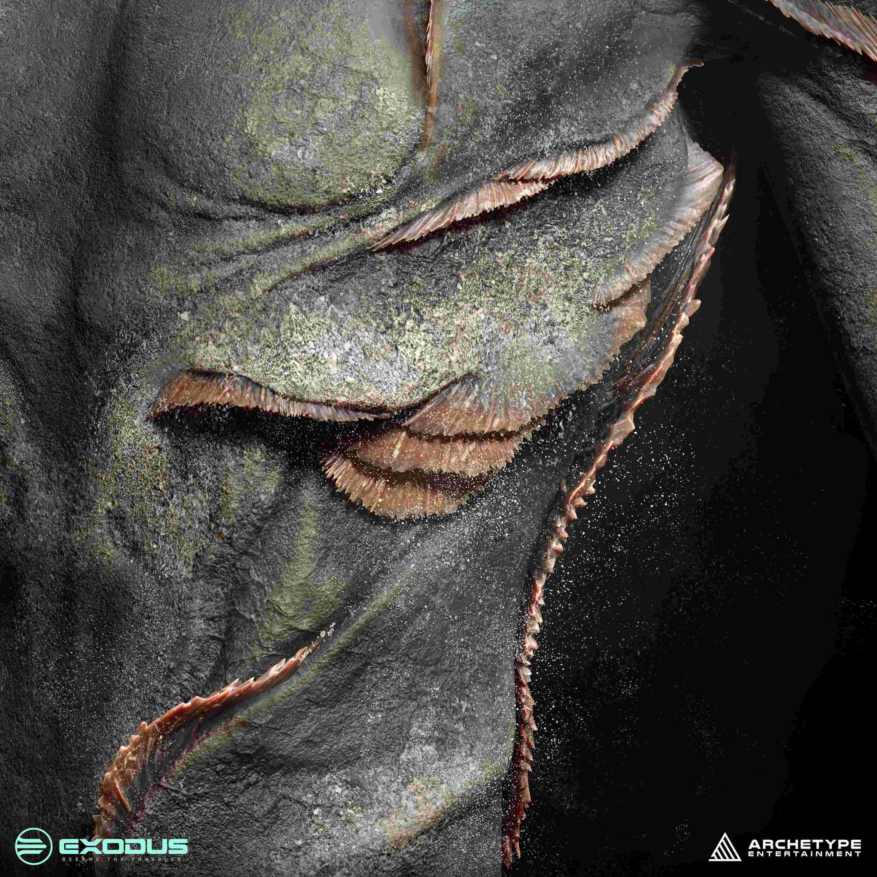
Early sketches focused on exploring silhouettes that felt tall, slender, ornate, and slightly uncomfortable… which is always fun. I looked for a form that felt engineered but also decorative. A lot of time went into thinking about how the surface could read almost like gilded armor, but without obvious panels, while still feeling organic and alive.
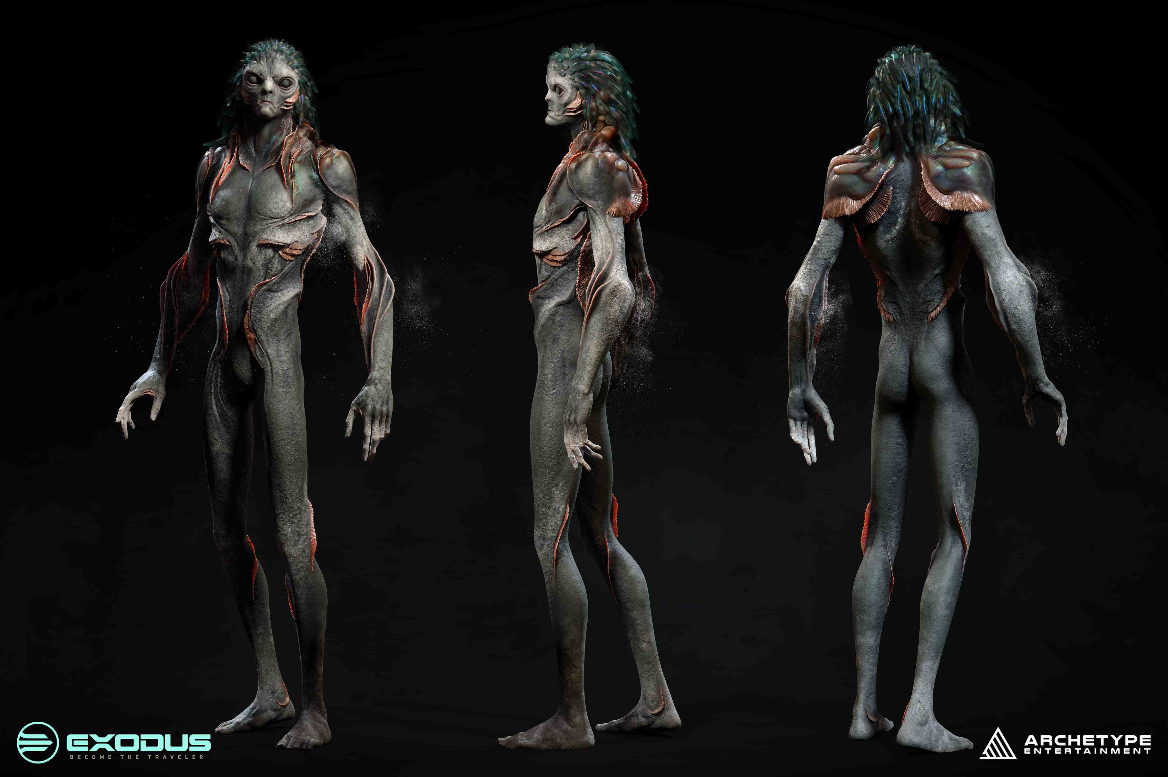
The goal was to create a shape that suggested they were designed to be seen as much as they were designed to function… beings shaped by a forgotten purpose, carrying the visual weight of that legacy.
“The Malabrachts are the gilded stewards of a forgotten time. Bioengineered by the Celestials, they were designed not for labor or war, but to preserve, maintain, and embody the grandeur of their creators. Their ornate forms and ceremonial presence are a reflection of a legacy long past, carrying the visual language of a civilisation that no longer exists.”
— From Exodus

This concept leaned heavily into expression, posture, stylised anatomy, and surface quality… using form to communicate status and narrative rather than function.
Here are some closeups:


The head of this concept was particularly interesting. The brief hinted at anemone or jellyfish-like appendages that would read almost like hair, so I explored several variations to figure out how this strange organic element could integrate with, and at the same time contrast against, the more structured and ornamental language of the body.
Here are some early sketches:


If you’re interested in learning more about my workflow and creature design process, check out The Extra Mile.
